PROJECT 4: UX/UI REVAMPING THE HAMBURGER MENU
- Deepika Sriraman

- Nov 24, 2025
- 14 min read
Updated: Dec 31
Project Overview
UX/UI Upgrade - Navigation & The Hamburger Menu
Client: Costco
Requirement:
Improving the UX, UI of any component, of your choice (eg: Hamburger Menu), of an e-commerce website that specializes in electronics & tech gadgets, competing with platforms such as Best Buy, Amazon, etc
Create comparable analysis
Card sorting
Recommend upgrades based on comparable analysis and card sorting
Arrive at a finalized sitemap of that particular component of the website
A low-fidelity wireframe of IA
The Memo:
Note: Kindly Click On Individual Slides & Galleries To Expand Them

Part 1: Overview
Why the Hamburger Menu?
A well-designed category tree or hamburger menu should function as a comprehensive access hub, not merely a product catalog.
Limiting these menus to product listings forces users to hunt across the site for essential actions such as logging in, accessing account settings, discovering services, finding support, or navigating to key informational pages.
When thoughtfully structured, the hamburger menu becomes a one-stop container for all primary website components—products, services, navigation links, utilities, and account-related functions—organized through clear taxonomy and hierarchy.
This approach reduces friction, minimizes cognitive load, and shortens task completion time, particularly on mobile devices and within apps where screen area is constrained.
By including key entry points into a single, contained, and scroll-independent navigation system, hamburger menus can be redesigned as a user-friendly interface that enhances discoverability and offers a more efficient and interactive experience across web and mobile platforms.
General UX/UI Misalignments on Apps, Platforms & Websites:
UX Misalignment: Structural and Behavioral
UX is responsible for the logic of the experience—how users navigate the system, how many steps are required to complete a task, and whether the structure aligns with user intent and entry behavior.
Common UX-level issues include:
High cognitive load
Misalignment with personalization
Mismatch with entry behavior
Inefficiency for goal-oriented users
From a UX perspective, the problem is not the taxonomy or hierarchy itself, but how it is enforced.
UI Misalignment: Expression of Structure and Control
UI is responsible for how the structure is visually expressed and interacted with. Many navigation systems fail not because the underlying IA is wrong, but because the UI obscures or flattens it.
Common UI misalignment—especially in hamburger and menu-based navigation—includes:
Overly long hamburger menus: Large, unstructured lists force excessive scrolling and make scanning difficult.
Lack of expand/collapse affordances: Missing or unclear +/- icons at primary category levels prevent users from expanding or contracting sections on first click.
Flattened visual hierarchy: Categories and subcategories are displayed at the same visual level, erasing parent–child relationships.
Improper containment: Navigation menus that are not contained in dedicated containers are difficult to scroll. This results in erratic behavior and loss of control.
No dedicated scroll regions: Deep menus should have their own scrolling areas; merging navigation scroll with page scroll creates chaos and inefficiency.
Weak visual grouping: Insufficient use of spacing, typography, and alignment makes it difficult to distinguish between primary, secondary, and tertiary levels.
Hover-Driven Vertical Menus as a Source of Friction: We will explore this in detail below.
These are UI implementation problems, not UX strategy problems—but they directly impact the overall experience.
Where UX and UI Must Work Together
Effective navigation requires UX and UI to reinforce each other:
UX defines the structure and flow: How many levels exist, where users enter, and how intent is supported.
UI makes that structure legible and usable: Through visual hierarchy, containment, and interaction patterns.
Best-practice patterns include:
Static primary categories that remain visible as users scroll within the navigation.
Progressive disclosure of subcategories, using accordions/drawers/carousels/hybrid, expandable panels, or dedicated sub-pages.
Contextual presentation of secondary and tertiary categories, rather than overwhelming users upfront.
Independent scrolling for navigation components, preserving predictability and control.
Streamlining the User Journey Without Flattening Meaning
Streamlining the user journey is a UX objective, but it depends heavily on disciplined UI implementation. Removing unnecessary steps, simplifying hierarchies, and creating intent-driven entry points should not compromise clarity or structure.
User journey mapping helps identify where structural complexity or interface design causes friction, hesitation, or drop-offs.
When taxonomy, hierarchy, UX, and UI are intentionally aligned, navigation becomes an accelerator rather than an obstacle, supporting faster task completion, higher conversion rates, and stronger business outcomes.
In short:
UX decides what should happen
UI decides how it is perceived and controlled
Navigation fails when either side attempts to compensate for the other, rather than working in concert. Refer to my blog on UX/UI - Menu & Structure to understand terms like Taxonomy, Hierarchy, Categories, Panels, Panel Types & Containers: Menu & Structure
Below is a diagrammatic representation of the components of a Hamburger Menu, its Structure on a Platform:

Below is a diagrammatic representation of a "Flattened" or unfavorably designed Hamburger Menu:

Hover-Driven Vertical Menus as a Source of Friction - Costco
A recurring UI misalignment in desktop (laptop) navigation—particularly evident in large, vertical, category-driven menus such as Costco's—is the overreliance on hover-based interactions.
While hover menus are often intended to speed up exploration, in practice, they frequently introduce chaos, inefficiency, and loss of control.
Key issues include:
Accidental panel activation: As users move their cursor vertically to scroll through categories, multiple panels open unintentionally due to hover triggers. This creates visual noise and makes it difficult to focus on a specific category or item.
Simultaneous panel expansion: Instead of opening one controlled, intentional panel at a time, multiple panels appear in rapid succession, overwhelming the user with content they did not explicitly request.
Impaired scrolling behavior: Users attempting to scroll to a specific category or product are repeatedly interrupted as panels expand and collapse based on cursor movement, rather than deliberate clicks.
Viewport overflow: Panels often exceed the visible height of the desktop viewport. Users must scroll up and down to view panel contents, creating bottlenecks in the user experience and increasing interaction costs.
Lack of dedicated menu scrolling: Despite their size and depth, these menus frequently lack their own scrollbars. As a result, users are forced to rely on the page-level scrollbar.
Context loss on page scroll: When the page scrollbar is used, the entire navigation menu disappears, forcing users to reopen the menu and restart their navigation journey from the beginning.
From a UI standpoint, this pattern violates several usability principles: predictability, containment, and user control. Hover-driven expansion prioritizes speed over precision, assuming exploratory behavior, while actively penalizing goal-oriented users who are trying to reach a specific product or category efficiently.
Why This Is a UI Problem (Not a UX or IA One)
In most cases, the underlying taxonomy and hierarchy are sound. The issue occurs in how those structures are exposed and interacted with:
Hover replaces intent-driven interaction (click or tap)
Panels are not constrained within a fixed container
Navigation does not have an independent scroll context
Visual and interaction feedback is inconsistent and overwhelming
A more resilient UI approach would require click-based expansion, single-panel focus, fixed containers, and independent scroll regions—ensuring that navigation remains visible, controllable, and persistent throughout the interaction.
Part 2: Comparative Analysis

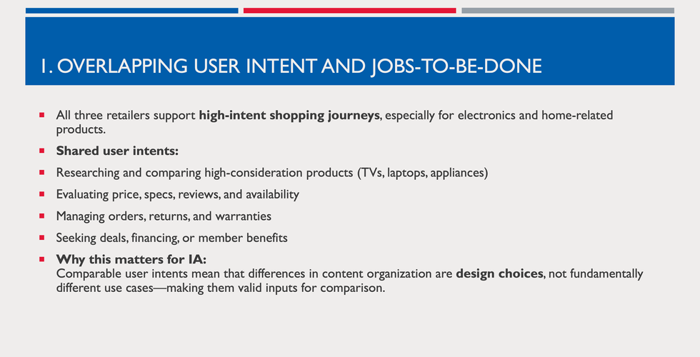
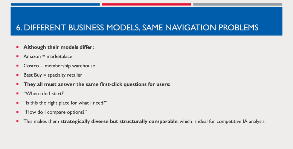
Why Amazon and Best Buy?
Amazon and Best Buy are strong comparables for Costco because, although their business models differ, they compete for the same customer decisions and share scalable information architectures that address similar challenges: extensive catalogs, high-involvement purchases, seamless shopping, and trust-based conversions.
The following slides (Gallery) provide a structured explanation aligned with UX, IA, and Product Strategy considerations. Click on slides to expand:


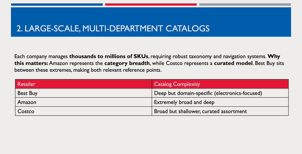


Content Organization Analysis:
Below is a content-architecture analysis of three major e-commerce sites—Best Buy, Amazon, and Costco—with a focus on how their content is organized. This analysis identifies common patterns and effective structures across these sites

Commonalities Across Comparables
Across all three sites, the following content organization patterns emerge as effective for large ecommerce platforms:
Hierarchical navigation: All sites use a hierarchical navigation structure to organize content.
Homepage → Categories → Subcategories → Product Pages
Prominent search bar with autocomplete: Search is central to user navigation, especially for extensive catalogs.
Category landing pages with filters: Category pages typically include navigational filters (brand, price, features), sorting, and pagination.
Product detail pages with structured information: PDPs contain images, specifications, pricing, reviews, and related items.
Cart and checkout workflow: All sites feature a multi-step checkout flow and persistent cart access.
Account and self-service sections: Includes orders, account settings, returns, and membership or loyalty programs.
Utility and policy pages: Shipping, returns, help, legal, and support content are consistently available in the site footer or in dedicated sections.
Hamburger Menu Container - Components & Organization
The following slide presents the Hamburger Navigation Menu and the initial click components of its container for Amazon, Costco, and Best Buy. These components reflect the primary mental buckets each company uses to organize its navigation menu content and are essential to developing effective information architecture.
Amazon (☰ All), Costco (☰ Shop), Best Buy (☰ Menu). Click on the slide to expand:

Primary First-Click/Initial Click Category Comparison (Desktop View)
Below is a comparative table of the primary first-click/Initial Click category structures for Amazon, Costco, and Best Buy, based strictly on the category lists from the slide above, with added UX/IA input. The emphasis is on organizational logic, scannability, and navigation usability.

Key Observations :
Amazon — Sectioned, Intent-Driven Model
Amazon's sectioned format is the most mature from an IA standpoint.
Chunking categories into labeled sections significantly reduces cognitive load.
Separating shopping, digital content, programs, and aligning with distinct user intents.
This model supports both exploration and direct lookup.
UX takeaway: Amazon sets the benchmark for scalable navigation by organizing content by user intent rather than product type.
Best Buy — Domain-Driven, Expertise-Led Model
Best Buy's categories reflect strong domain expertise and align with high-intent electronics shopping.
The grouping supports comparison and solution-based navigation.
Peripheral lifestyle categories are present but less clearly integrated.
UX takeaway: Best Buy strikes a balance between Amazon’s scale and Costco's simplicity, but must avoid uncontrolled category expansion.
Costco — Alphabetical, Flat Model (Key Opportunity Area)
Costco's navigation is purely alphabetical, which supports known-item lookup but severely weakens discovery.
All categories carry equal visual weight, creating decision paralysis.
The long scroll list introduces scroll fatigue and disorientation.
Vital UX Issues Identified:
Navigation scrolls with the page rather than remaining fixed.
No independent scrollbar for the navigation panel.
Users lose context when navigating deep into the list.
Recommended Improvements:
Introduce sectioned grouping (e.g., Grocery, Home, Electronics, Services).
Keep the navigation panel static/sticky.
Implement an independent scrollbar for the navigation menu.
Preserve alphabetical order within sections, not across the entire list.
UX takeaway: Costco's IA prioritizes internal completeness over user cognition and requires modernization.
UI Comparative Analysis: Desktop Navigation Model (Hamburger Menu) - Click on the slide below to expand.

Which comparable content-organization Structures should COSTCO adopt, adapt, or avoid for Navigation:
Kindly see the table on the next slide for reference.
How to Use The Table:
Treat "Adopt" patterns as near-term IA enhancements
Treat "Adapt" patterns as design hypotheses for testing (e.g., card sort, tree test)
Treat "Avoid" patterns as explicit guardrails for navigation and taxonomy decisions
Click on the slide to expand:

Part 3: Card Sorting Exercise

Overview
Card sorting is a user-focused research technique that explores how users instinctively group, categorize, and label information.
Participants organize content items, called 'cards,' into meaningful groups, either using predefined categories (closed card sorting) or creating their own (open card sorting).
This process uncovers users’ mental models and expectations about how information should be organized.
Card sorting is commonly used to inform information architecture decisions, including navigation structure, category labels, and site maps, particularly for content-heavy digital products such as e-commerce websites.
Why Card Sorting Is Essential?
Card sorting is essential because it provides insight into how users expect content to be structured, rather than relying solely on designers' or stakeholders' decisions.
Relevance to Modern E-commerce
In modern e-commerce—where search, personalization, and promotional entry points dominate—card sorting remains vital because it defines the site's structural backbone. Even when users move past navigation, a clear and user-aligned hierarchy ensures:
Consistent content relationships
Effective search indexing
Logical recommendation groupings
A reliable fallback when automated systems fail
Items for Card Sorting
The 40 items chosen for Card Sorting were standard navigation tabs and common everyday products and services available on all three websites—Amazon, Costco, and Best Buy—particularly in the Electronics category.
This card-sorting task aimed to understand participants' preferences for Hamburger Navigation Menus, focusing on how they prefer the content organized to ensure easy and convenient navigation. This was an open card-sorting activity in which participants labeled categories using the terms they had used to identify them.
These cards encompass structural elements that appear across the comparable sites - This card set is neutral. It does not assume Amazon’s scale, Costco’s alphabetical model, or Best Buy’s domain depth. That neutrality makes it ideal for uncovering user mental models rather than reinforcing existing navigation biases. Click on the slide to expand.


Interface for Card Sorting & Instructions
This was a remote card-sorting project, and I designed the card-sorting tool's interface in Figma. I styled the interface to resemble a fun Solitaire Card Game set in an '80s arcade, aligning with current 2025 trends.
The card-sorting tool interface was designed with all principles of Design, UX & UI in mind. The prototype was tested with two users; feedback was collected, corrections were implemented, and it was subsequently published. The link was then sent to participants for card sorting—see the screenshot on the next slide.
Here is the link to how we developed the inetreface for the research: Designing Card Sorting Tools & Interface
Instructions: We instructed the participants to organize their own drop-down vertical Hamburger Menu, group and assign first-click categories/sub categories, with the first column from the left on row 1 being the topmost part of the vertical Hamburger Menu, and the last column on either row 1 or row 2, depending on the number of categories they create, being the bottommost part of the vertical Hamburger Menu. We uniformly labeled the item cards to facilitate participant sorting and asked participants to place the cards into the categories they created.

Participant 1

Participant 1's Exercise

Participant 1's Qualitative Summary & Analysis of Sorting Logic


Participant 2

Participant 2's Exercise

Participant 2's Qualitative Summary & Analysis of Sorting Logic


Participant 3

Participant 3's Exercise

Participant 3's Qualitative Summary & Analysis of Sorting Logic


Participant 4

Participant 4's Exercise

Participant 4's Qualitative Summary & Analysis of Sorting Logic


Cross-Participant Comparison (Qualitative Analysis)
Common Groupings & Variations: See the table on the following slide.
How to read this table –
Common Grouping (Analytical): Research-level grouping inferred across participants
Item Cards: All 40 cards are covered
P1–P4:
✓ = participant made a meaningful distinction aligned with this grouping
Products (flattened) = Participant 2 intentionally did not differentiate
△ = partial/ambiguous/duplicated placement
P = Participants
This table compares navigation strategies.

Quantitative Analysis
How to read this table:
Agreement Level is based on the percentage of participants (out of 4) who conceptually aligned
IA Risk Level reflects the likelihood of user confusion or various mental models
Design Implication translates the numbers into actionable IA guidance
Refer to the table on the next slide:
Quantitative Comparison Table
(40 × 4 matrix + Agreement Count + Agreement Percentage)
Agreement Percentage formula:
Agreement Count ÷ 4 × 100
Followed by Quantitative Findings Summary in a tabular form.
Note:
Participant Strategy Impact (Quantified) - Participant 2 is the only contributor to reduced agreement scores, due to intentional flattening.
Without Participant 2, agreement for many product items would rise to 100%.
Quantitative implication: The variance reflects navigation strategy differences, not confusion.


Given the small sample size (n=4), agreement percentages are used to identify relative consistency and ambiguity rather than statistical significance. Quantitative results support qualitative insights derived from participants' reasoning.
The cross-participant summary table synthesizes qualitative patterns and navigation strategies, while the quantitative comparison table encodes each participant’s card placements to calculate agreement, variance, and clustering.
Part 4: Upgrades & Enhancements

Why Upgrade Costco’s Hamburger Menu — Even in a Search-First World
Improves SEO & Search Engine understanding, enhances Marketing
Supports all Entry Points (not just the Homepage)
Critical for Mobile Web Users (non-App traffic), increases Mobile Conversion
Aligns with Real User Mental Models
Search and Navigation Work Together - Search finds what users know, and Navigation helps users understand what else exists
Costco's desktop hamburger menu is a task-oriented drawer (similar to Amazon) but lacks strong first-click intent signaling and reflects internal merchandising silos rather than user mental models.
Card-sorting results and competitive comparison indicate clear opportunities to improve first-click success, reduce cognitive load, and strengthen electronics discovery.
Recommendations for Improving Costco’s Hamburger Menu
1. High-Level Structural Recommendations
1.1 Shift from Category Overload to Intent-Based Hierarchy
Problem observed
Costco's current hamburger menu is overly long and flat, forcing users to scan many unrelated categories.
Card sorting participants consistently grouped items by user intent (account tasks, discovery, products, services) rather than Costco’s current mixed taxonomy.
Recommendation
Adopt a layered structure:
Account & Member Actions
Discover & Shop Shortcuts
Core Product Domains
Services & Installations
Secondary / Seasonal / Long-Tail Categories
This aligns with:
100% agreement items (Account, Orders, Services).
Reduced cognitive load at first click.
2. Reorganizing Top-Level Categories (First Click)
2.1 Account & Member Hub (Move to Top)
Problem observed
Account-related items had 100% agreement across participants.
Participant 4 strongly framed this as a "control center."
Recommended grouping
Create a clearly labeled "My Account" or "My Costco" section at the top:
Include:
Log In / Sign Up
Membership
Track Order / Order History
Product Reviews & Ratings
Returns & Exchanges
Customer Support / Help
Why
Reduces friction for repeat Costco members.
Matches real user mental models from the study.
2.2 Discover & Shop Shortcuts (Second Layer)
Problem observed
Deals, Best Sellers, Recommendations, and Gift Cards had near-perfect consensus.
Users treat these as shortcuts, not categories.
Recommended grouping
Create a "Discover" or "Shop Highlights" section:
Include:
Deals & Promotions
Best Sellers / Top Rated
Recommendations / Trending Products
Gift Cards & Tickets
Why
Encourages exploration.
Separates browsing from structured product navigation.
3. Rationalizing Product Categories
3.1 Consolidate Electronics into a Clear Domain
Problem observed
Electronics-related items were scattered across multiple Costco categories (Electronics, Computers, Office Products, Home Improvement).
Card sorting showed 75% agreement that these belong together conceptually.
Recommendation
Create a single, strong "Electronics & Tech" category, with internal subcategories:
Electronics & Tech
TVs & Home Entertainment
Audio & Headphones
Computers & Accessories
Mobile Phones & Wearables
Gaming Consoles & Accessories
Smart Home Devices
Electronics Accessories
Why
Matches user expectations from Amazon & Best Buy.
Reduces ambiguity for high-value products.
3.2 Separate Home vs Electronics More Clearly
Problem observed
Items like Home Appliances, Home Electricals, and Smart Home Devices caused 50% agreement, indicating ambiguity.
Recommendation
Define clear boundaries:
Home & Living
Furniture
Home & Kitchen
Patio / Lawn / Garden
Mattresses
Smart Home Devices
Nested under Electronics & Tech, not Home
Why
Aligns with participant logic that "smart" = technology.
Reduces misclassification.
4. Handling Ambiguous Categories (High IA Risk)
4.1 Fitness, Pets, and Baby Products
Problem observed
Fitness & Health, Pet Trackers, Baby Monitoring showed lowest agreement (50%).
Participants resolved this either through duplication or dedicated categories.
Recommendations
Introduce cross-listing rather than forcing a single category.
Example:
Fitness & Health appears under:
Sports & Fitness
Electronics & Tech (for wearables)
Pet Trackers under:
Pet Supplies
Electronics & Tech
Why
Reflects multiple mental models.
Improves findability without bloating the menu.
5. Services & Installations: Make Them Explicit
5.1 Group All Services Together
Problem observed
Services consistently separated from products across all participants.
Recommendation
Create a "Services" category:
Include:
Home & Installation Services
Costco Direct
Costco Next
Tires & Auto
Special Events
Why
Reduces confusion between buying products and booking services.
Improves clarity for first-time users.
6. Reduce Cognitive Load from “More Categories”
6.1 Replace “More Categories” with Structured Expansion
Problem observed
"More Categories" is vague and forces extra clicks without signaling value.
Recommendation
Replace with:
"All Categories" (expandable)
Why
Participants showed discomfort with unclear destinations.
Improves scannability.
Visual & Interaction Improvements (Desktop Focus)
7.1 Stabilize Scroll Behavior
Problem Observed
Navigation scrolls with the page rather than remaining fixed.
No independent scrollbar for the navigation panel.
Users lose context when navigating deep into the list.
Recommendations
Keep the navigation panel static/sticky.
Implement an independent scrollbar for the navigation menu.
Lock background scroll when menu is open.
Make drawer height fixed with internal panel transitions, not continuous scroll.
Section headers.
Subtle dividers.
Optional iconography.
8. Depth and Expansion Behavior
8.1 Replace Hybrid Accordion + Scroll with Controlled Panels
Problem Observed
Extended scrolling inside the drawer.
Scroll conflicts with page scroll → unstable desktop experience.
Users lose sense of hierarchy boundaries.
Recommendation
Adopt a panel-based drawer model:
Level 1: Fixed list (no scrolling).
Level 2: Opens in a dedicated panel to the right.
Explicit "Back" control to return.
Why
Prevents scroll conflict.
Provides spatial hierarchy cues.
Improves navigation stability on laptops/desktops.
The card-sorting exercise indicates that users do not think in Costco’s internal merchandising silos. They think in:
Tasks
Technology vs lifestyle domains
Discovery shortcuts
By restructuring the hamburger menu around these mental models, Costco can:
Improve first-click success
Reduce navigation friction
Better compete in electronics discovery
Stabilize drawer behavior
Finally, rename the Hamburger Menu from "Shop" to "My Menu" or "My Costco". Elevate "My Menu" or "My Costco" as the Primary Entry Point.
Part 5: Recommended Site Map
For the Category Electronics, for Costco’s Hamburger Navigation Menu -


Part 6: Low-Fidelity Navigation Wireframe (With IA Focus)

Disclaimer: The presentation is not an endorsement or advertisement for Costco, Amazon, or Best Buy; it is solely for research and illustrative purposes. The same applies to the webiste audit and competitor/comparative analysis.
Comments