PROJECT: DESIGNING CARD SORTING TOOLS
- Deepika Sriraman

- Nov 23, 2025
- 10 min read
UX/UI - Product Designing, Functional Architecture, Product/Project Management
How to design an advanced card sorting tool for a better user experience
Let's design and develop a survey/card-sorting template using UX principles and iterative actions. This will involve the design process, structure, and decision-making.
In UX/UI terms, we are going to:
Identify a recurring user need,
Design a scalable solution
Design the Interface
Validate it through iteration,
and release it for broader use.
Overview
Card sorting is a user-focused research technique that explores how users instinctively group, categorize, and label information.
Participants organize content items, called 'cards,' into meaningful groups, either using predefined categories (closed card sorting) or creating their own (open card sorting). This process uncovers users’ mental models and expectations about how information should be organized.
Card sorting is commonly used to inform information architecture decisions, including navigation structure, category labels, and site maps, particularly for content-heavy digital products such as e-commerce websites.
Why Card Sorting Is Essential?
Card sorting is essential because it provides insight into how users expect content to be structured, rather than relying solely on designers' or stakeholders' decisions.
Its key benefits include:
Aligns navigation with users: Reduces confusion by organizing content in ways that feel instinctive to users.
Improves findability and efficiency: Helps users locate information more quickly, supporting faster task completion and higher conversion rates.
Validates labels and terminology: Identifies language that users naturally understand and filters ambiguity in navigation.
Supports scalable and flexible IA design: Creates a strong structural foundation that can accommodate future content growth.
Provides defensible design decisions: Supplies qualitative and quantitative data that validates IA recommendations in academic and professional contexts. Kinds of Card Sorting
Open card sorting allows participants to freely group content and develop their own category labels. This approach is especially valuable in early design stages, as it displays users’ natural mental models and the terminology they use to describe content.
Closed card sorting provides participants with predefined categories and asks them to assign content items to those categories. This method is beneficial for validating or improving an existing information architecture and assessing whether current labels and groupings are instinctive to users.
Hybrid card sorting combines aspects of open and closed card sorting. Participants may begin with predefined categories but may rename or create new ones. This method supports exploratory discovery through structural validation and is particularly well-suited to redesign projects.
Remote card sorting is conducted online using digital tools, enabling access to a larger, more diverse group of participants. Although it does not require real-time observation, it is efficient, scalable, and widely used in academic and professional research.
In-person card sorting occurs in a facilitated environment, allowing researchers to observe participants' behavior and ask follow-up questions. While it requires more resources, it yields more detailed qualitative insights.
How to Build a Card Sorting Template?
The project below presents a step-by-step method for developing a Card-Sorting or Survey Tool:
Card-Sorting Tool — UX Design Rationale
Project Overview:
This project involved the design and implementation of a custom open card-sorting tool to study how users categorize and structure content for an e-commerce hamburger navigation and product catalog.
The tool was designed for remote participation, emphasizing clarity, efficiency, and error prevention to ensure high-quality research outcomes.
The final solution consisted of three sequential Screens:
Instruction Screen (1)
Participant Board (2)
Sorting Board (3)s
Screen 1 and 2 were standardized across all users, while Screen 3 instantiated individual, isolated sorting environments for each participant.
My Ownership:
I served as the UX/UI Lead and Functional Architect, responsible for:
Defining the card-sorting scenario and research goals
Planning the end-to-end user flow
Designing the features of the tool & information architecture
Creating wireframes
Defining all interaction rules, states, and constraints
Coordinating iteration based on usability testing feedback
Other contributors who implemented based on my specifications:
A graphic designer/Figma Specialist created the prototype using Figma
A coder implemented interaction logic
A developer handled functional integration and deployment
Two external testers validated the experience before live deployment.
Structuring and Card Definition
Card-Sorting Method
Method: Open card sort
Number of cards: 40
Task: Participants created their own categories and hierarchies
The goal was to observe mental models and categorization logic related to e-commerce navigation.
Card Selection Rationale
To ensure realism and relevance, I conducted a comparative analysis of three electronics and lifestyle e-commerce platforms using hamburger navigation menus. A hybrid card sort is generally recommended for established platforms, but we decided to create an open card sort for research purposes.
Common structural patterns and product groupings informed the final card set.
The 40 cards were selected based on:
Content frequency across platforms
Expected priority in navigation
Logical grouping potential
The image below contains 40 items for card sorting. Click on it to expand:

Design Highlight: Real-world comparative analysis ensured ecological validity and improved the reliability of the resulting navigation insights.
Designing the Tool for Desktop/Laptop
Screen 2 — Participant Board (Entry Point After Instructions)
Purpose: To allow participants to clearly identify and enter an available sorting room while preventing overlap or accidental interference.
The image below shows a Research-Ready Prototype of Screen 2. Click on it to expand:

Layout and Visual Design
Minimalist, flat UI with subtle neumorphic styling
Light grey background with high-contrast white participant tiles
Hover states reinforced interactivity through shadow depth and border emphasis.
Because neumorphism can reduce accessibility due to low contrast, I intentionally:
Used bright white tiles
Applied a distinct contrast hover border
Maintained readable typography and spacing
Navigation and Orientation
A “Back to Instructions” link with a left-arrow icon was placed in the top-left corner, aligning with user expectations and reducing orientation loss.
A concise descriptor (“Open Card Sort – Ecommerce Navigation”) immediately clarified the task context.
The label “Participant Boards” established the page’s purpose in two words.
Participant State Awareness
Each participant tile:
Displayed a placeholder label (Participant 1–4)
Updated dynamically to show the participant’s name once claimed
Included a small numeric status indicator (01–04) that changed color when occupied
This prevented multiple users from entering the same sorting environment.
Design Highlight: Introducing real-time occupancy indicators and name propagation reduced collisions and participant confusion in a remote, unsupervised context.
Screen 3 — Sorting Board (Primary Task Environment)
Purpose: To support efficient, flexible, and error-tolerant open card sorting while capturing contextual research data.
The image below is a Research-Ready Prototype of Screen 3. Click on it to expand:

Header Design (Two-Level Structure)
Header Level 1 — Task Controls

Save Work (Primary CTA): High-contrast fuchsia button with icon to encourage frequent saving
Export My Work: Enabled participant and researcher data extraction
Add Category Label: Mango-colored CTA with plus icon to emphasize category creation
These controls were made intentionally different from the muted color palette to:
Grab attention
Reduce missed actions
Improve task efficiency
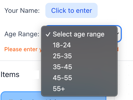
Header Level 2 — Participant Metadata

This level captured contextual research data without interrupting task flow:
Name entry (required to claim board)
Age range (dropdown)
Device used
Industry
Instructional messaging in red reinforced the requirement to claim the board before starting.
Design Highlight: Separating task actions from research metadata across two header levels prevented cognitive overload while preserving data collection.
Sorting Workspace Layout (Below Header)
The workspace was divided into three vertical columns, each with a distinct function.
Column 1 — Item Pool
Container for item cards
Randomized arrangement of item cards
Drag-and-drop enabled for ease of use
Column 2 — Sorting Board
Large white board for category construction
Independent horizontal and vertical scrollbars
Supported free-form spatial organization
Box Shadow, Hover Effect, Active State: All scrollbars are interactive
Click and drag to navigate the entire sorting area
Easy to click and drag to navigate the entire 1600px wide × 2500px tall board

Independent horizontal and vertical scrollbars

Category Cards (Yellow)
Editable via pencil icon or double-click
Deletable via trash icon
Drag-and-drop enabled within canvas
Item Cards (Blue)
Non-editable labels to preserve data integrity
Duplicate function enabled, with icon on click, for multi-category placement
Delete icon shown, on click, only on duplicates to prevent accidental data loss
Would be the same width as the Category Cards once dragged and dropped into the sorting board and placed one below the other.
Visual encoding:
Original items: Neon blue border
Duplicates: Neon pink border
This allowed both participants and researchers to easily distinguish card states.

Column 3 — Qualitative Input Panels
Two vertically stacked panels:
Notes / Think-Aloud
Questions / Feedback
Features:
Placeholder instructional text that fades on input
Independent scrollbars
Ample text space
388px height
This design supported remote open card sorting, where verbal observation is not possible.

Design Highlight:Enabled accurate analysis of cross-category associations without increasing participant effort.
Screen 1 — Instruction Screen
Purpose:To prepare participants to complete the task independently, confidently, and correctly.
Instruction Design
Step-by-step guidance using simple, plain language
Key information highlighted in blue
Navigation instructions grouped on grey backgrounds
Emojis used to humanize tone and reduce formality,and for quick visual scanning.
No login system or email required. Anonimity can be maintained. Clicking the link sent to participants will enable them to start the exercise.
This reduced anxiety and improved comprehension, especially for non-technical participants.


Design Highlight: Adopting a friendly, conversational instructional tone increased approachability and reduced drop-off at task start.
Responsive Interaction Design Across Devices
Although the above description focused on designing the tool for desktops and laptops, the same typography, color palette, and structure was preserved when making the tool compatible for other devices.
Example: Used bg-blue-300 with a blue-400 border, or bg-yellow-400 with a yellow-500 border. Gray color (#888) to make elements stand out, interactive, and darkening to #555 when hovered over, making product/tool compatible with all browsers, etc

Cross-Device UX Strategy
Click on the gallery below to expand:


Verification & Validation Testing
Testing Approach
Prior to deploying the card-sorting tool to actual participants, we conducted verification and validation testing to ensure functional reliability, cross-device compatibility, and data integrity.
Test Setup
Independent Tester 1: Desktop (external monitor)
Independent Tester 2: Laptop
My Testing: iOS mobile device
Additional By My Team Members: Android mobile device, Tablet device
This multi-device testing approach was designed to reflect participant variability, including different input methods (mouse vs. touch) and screen sizes.
Issues Identified and Resolutions
1. Drag-and-Drop Limitations on Mobile and Tablet
Issue: Initial drag-and-drop interactions did not function consistently on touch-based devices.
Root Cause: The interaction logic was optimized for mouse input only.
Resolution: The team implemented a MultiBackend interaction system supporting both mouse and touch input simultaneously.
Resulting Behavior:
Desktop users: Mouse-based drag-and-drop
Mobile users: Touch-and-hold drag-and-drop
Tablet users: Touch or mouse input
Hybrid devices (touch-enabled laptops): Full dual-input support
UX Impact:Ensured interaction parity across devices without requiring separate interaction models.
2. Mobile Card Placement and Visual Organization
Issue: On smaller screens, card placement appeared visually cluttered and inconsistent.
Resolution: Implemented a grid snapping system with the following rules:
Cards snap to a 20px grid
Prevents random placement
Enforces visual alignment
UX Impact: Improved readability, scannability, and perceived professionalism of the interface, particularly on mobile.
3. Smart Auto-Alignment and Auto-Stacking (Items & Categories)
Issue: Manual alignment of cards was tedious and error-prone, especially on touch devices.
Resolution: Introduced smart auto-alignment and auto-stacking logic for both item cards (blue) and category cards (yellow):
Behavior:
Cards auto-align when dropped near each other
Vertical auto-stacking within a column
Consistent spacing of 60px between stacked cards
One-drop organization: dropping a card near another automatically stacks it below
Category cards auto-align horizontally and vertically when placed near other categories
UX Impact: Reduced interaction friction and cognitive effort while maintaining a clean, structured workspace.
4. Unified Stacking Logic Across Card Types
Issue: Item cards and category cards previously behaved inconsistently.
Resolution: Standardized stacking behavior so that:
Both card types follow identical auto-alignment rules
Both organize into neat vertical columns when placed nearby
UX Impact: Improved consistency, predictability, and learnability of interactions.
*Note: 3 is about introducing intelligent alignment and stacking behaviors to improve usability.4 is about standardizing those behaviors across all card types to ensure consistency.
This maps cleanly to Nielsen’s heuristics:
Flexibility and Efficiency of Use → Item 3
Consistency and Standards → Item 4
5. Data Visibility and Storage Architecture
Issue: Participant data was stored in browser LocalStorage, making results device-specific and invisible to researchers across devices.
Root Cause: LocalStorage does not support shared or centralized data access.
Resolution:
Replaced LocalStorage with a Supabase cloud database
Centralized all participant data
Enabled cross-device visibility
Enabled real-time updates
Additional Outcome:
Participant names now update live on the board selection screen
Research Impact:Resolved a vital architectural limitation and ensured data integrity, accessibility, and scalability.
Additional Features Introduced
Auto-Save
Automatic save every 30 seconds
Manual save retained as secondary control
Significantly reduced risk of data loss
Researcher View
Accessible via a purple “Researcher View” button on the instruction page
Displays all four participants’ progress simultaneously
Enables real-time monitoring without interfering with participant tasks
Data Export and Management
Export Options:
Export all participant data in a single file
Export summary CSV (participant-level overview)
Export detailed CSV (item-by-item placement for analysis)
Import and Reset Options:
Import participant data files from different devices
Clear all data to reset the tool for a new sessionData Collection Methods
Method A — Single Device (Simplest)
All participants use the same device
Researcher opens Researcher View
Export all data at once
Method B — Multiple Devices
Each participant exports their own data file
Researcher imports all files via Researcher View
Export consolidated dataset for analysis
Deployment, Easy Onboarding and Usage Workflow
Share the application link with participants
Participants complete the card-sorting task (auto-save every 30 seconds)
Collect data:
Single device: Export directly from Researcher View
Multiple devices: Collect exported files and import them
Analyze results using CSV exports in Excel
A Variation
I designed another variation of the tool, a game-inspired card-sorting interface that combines UX research rigor with expressive UI and interaction design, to demonstrate how research tools can be adapted for engagement-driven environments such as games.
The interface uses the same set of 40 e-commerce navigation cards and supports an open card-sorting exercise for a hamburger menu structure.
The retro-futuristic aesthetic—drawing from arcade-style visuals and playful motion—adds a sense of novelty while preserving the core research functionality. A deviation from the flat minimalism & subtle Neumorphism from the previous design above.
By structuring the exercise as an interactive game rather than a purely analytical task, the design aims to improve motivation, sustained attention, and willingness to complete the activity, particularly in remote or unmoderated settings.
Despite its stylized design, the project upheld key usability principles like clear affordances, consistent interaction patterns, and task clarity to keep the experience intuitive and suitable for research.
This demonstrates how structured research interactions can be translated into game-like systems, aligning player engagement with data quality—an approach that can be directly applied to UX/UI challenges in the gaming industry.
The Template: Click on the image to expand


How the Recurring User Need Was Identified?
Recurring User Need was mostly based on my personal experience and that of the collective during the lockdown and the pandemic, particularly concerning remote work and working from home.
I identified a recurring user need through a combination of experince, upfront research, structural design decisions, and validation via interaction requirements, rather than through a single moment of discovery.
Specifically, the recurring user need was the need for clarity, autonomy, and error-safe progression in a remote, unsupervised card-sorting task.
Mapping the Recurring User Need to Nielsen’s UX Heuristics
Core User Need: Clarity, confidence, and error-safe autonomy in a complex, remote card-sorting task without live moderation.
Primary Usability Heuristics: Click on slide to expand

Error Reduction, Cognitive Load & Support: Click on slide to expand

Comments